A Confluence of Design and Hospitality - The Janak

The Janak

The Janak had been a popular single screen theater of Delhi, which has now been revamped and replaced by an International Multiplex –Cineapolis, with world-class amenities. The client wanted a quirky food court, with a seamless transition between the movie theater and dining area. The audience at The Janak, not only includes families but youngsters due to its close proximity to eminent schools and colleges of Delhi.

Design Idea

The Janak food Cort

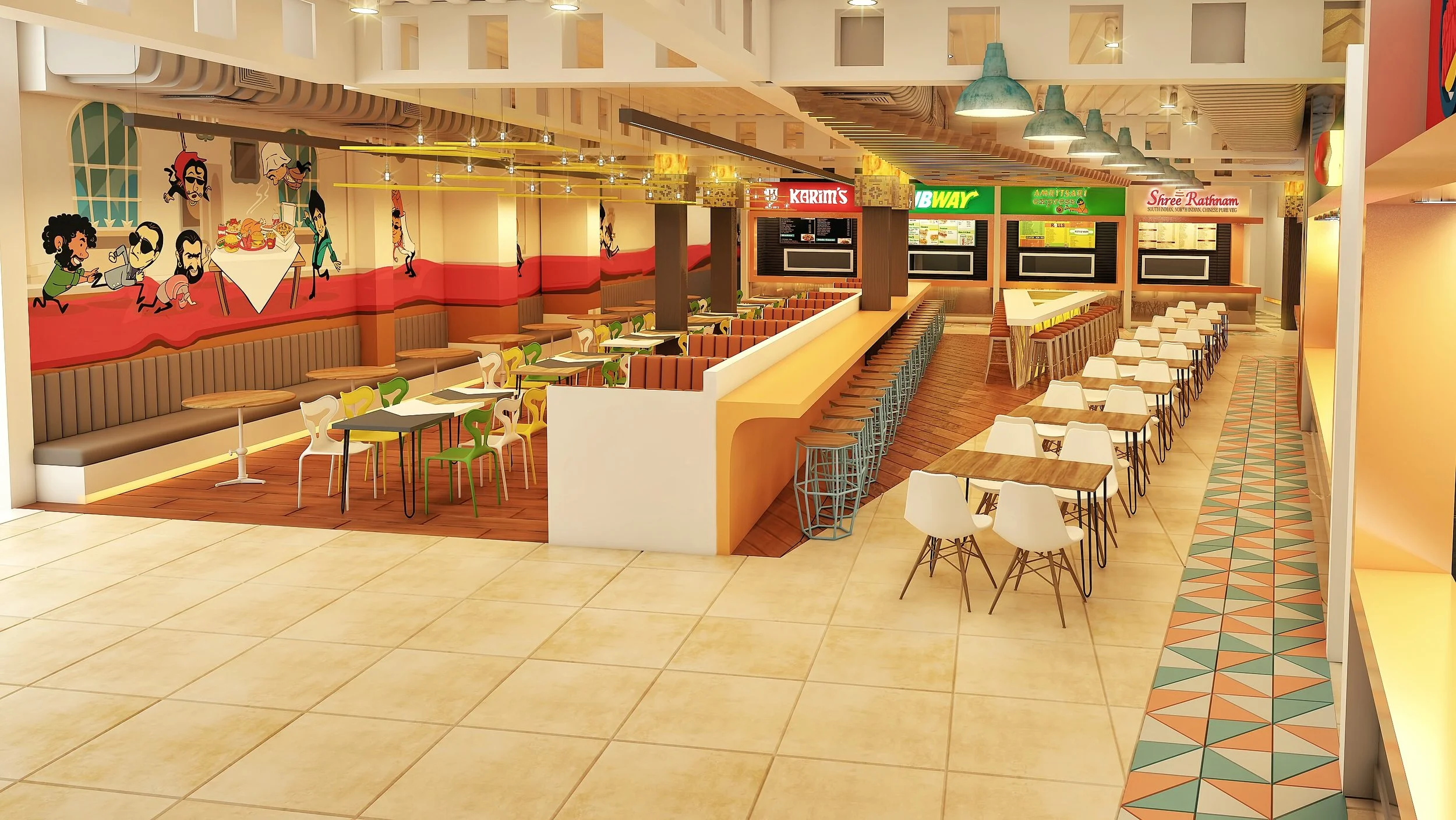
It’s a fact that Indians love Bollywood and “The Janak - Food Court” is one of a kind food court in India themed on the same. Detaching from the monotonous public food court design – the food court at “The Janak” is designed to be colourful, inviting, quirky and vibrant. The food court on the ground floor and the cinema on the first, are planned to be translating a sense of continuity between both the community spaces.

The key differentiating features of the food court includes  -Customized 55 Feet Wall Art themed on our love for Bollywood showcasing tug of war for food between Bollywood heroes and villains. Customized lights based on Bollywood Movie themes and hanging sculptures at the entry are other intriguing design elements added to decor of the building.

Material & Technology

The Janak

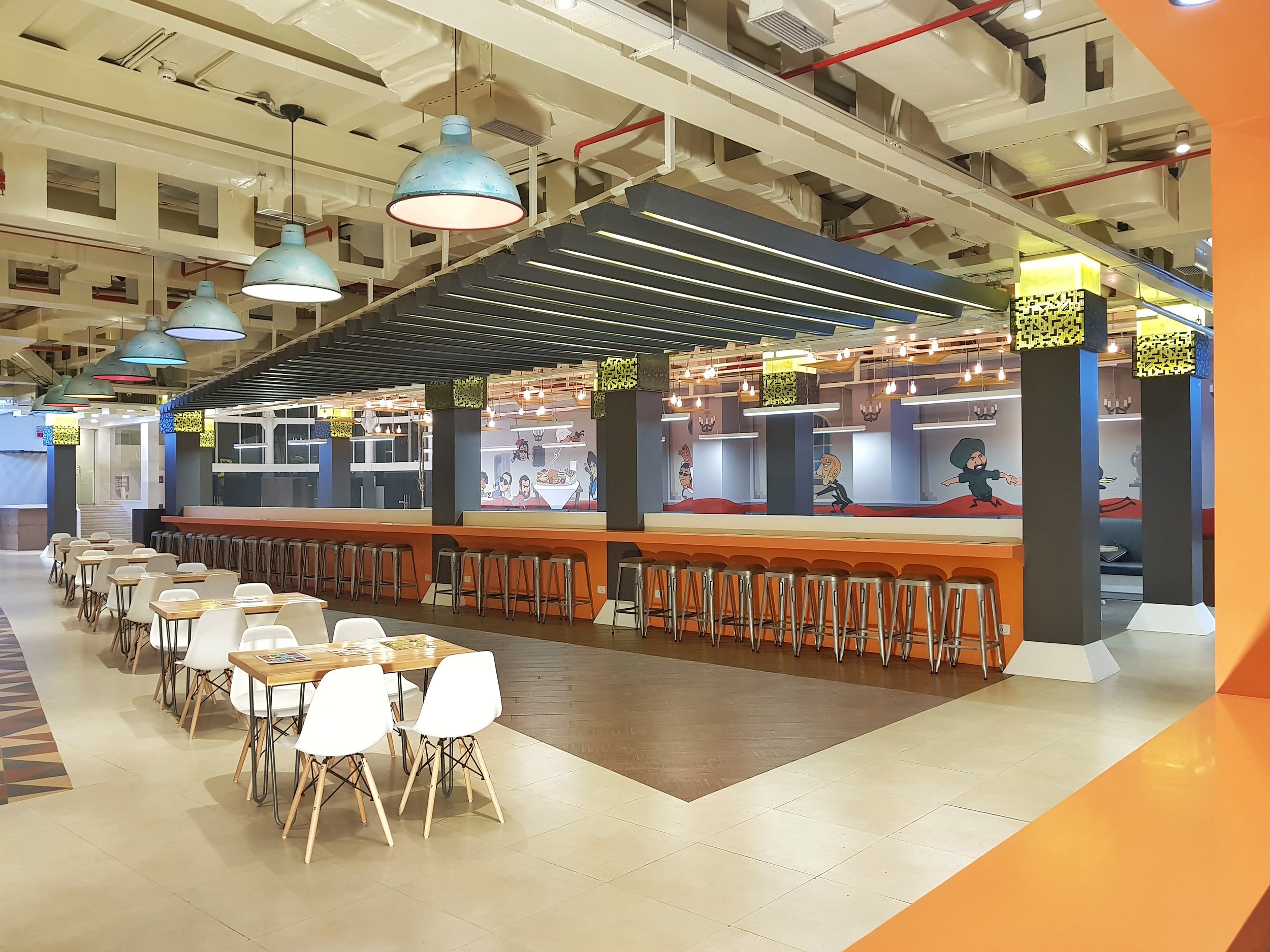
 A predicament encountered was with extra number of pillars that the space constituted. Expertly incorporated, the pillars were made to look as the feature of the whole space by using customized MDF pixel boxes diffusing warm light to create a vibrant environment. The floor plan was designed to fit in maximum seating of 220 seats. Tolex stools have been added to a linear orange 55 feet table to accommodate a large number of people

 We also employed 5 different kinds of flooring options in the space however, the highlight are the 2500 triangular pieces (with 3 different colours) designed to accentuate the area bordering the kiosks of the food joints.

Project Highlights

Lights – 

IMG_8030.JPEG

36 pieces of custom lights have been designed ranging from 1 feet to 36 feet. The lights and the flooring continue in the same triangular synchronization. The pillars are the feature of the space as they are beautified with alabaster sheets and pixilated mdf (from screens) backlit with led.


Wall Art –

The Janak

A 55 feet wall art was specially designed to portray the main essence of the space. It showcases a tug of war over food between the famous Bollywood heroes and villains.


Sculptures –

The Janak

The facade of the building features a glass installation – 50 ft. high.  This prominent feature of The Janak exhibits human sculpture climbing the ropes, signifying the heights that the existing The Janak Cinema had achieved over a period of time. The sculptures have been placed at different heights with the best view from the first level of the building supporting this all glass enclosure.

FACT FILE


Project Name: The Janak Food Court
Location: New Delhi
Client: Skipper Properties Pvt. Ltd.
Design Team: UdaaiBatra, UB Design
Commencement Date: December 2017
Completion Date: MARCH 2018
Area: 20250 Sq. Ft.

 The magnificent Janak Cinema multiplex in Janakpuri has total 4 Screens with 740 seating capacity. The theater offers an exceptional 3D experience with Real D 3D technology in 2 screens and 100 percent digital projection in all its screens. The flagship F&B offering from Cinépolis – Coffee Tree offers delectable gourmet food that endeavours to provide enhanced cine experience for Delhites like never before.

The Janak

Design In Retail - Reeti Arneja

Retail Design is visceral in nature. Apart from creating a good-looking store with aesthetically pleasing displays, retail store design is a well-thought-out strategy to set up a store in a way to optimize space and sales so that even if a salesman is unavailable, the store can engage its customers sell itself. The way a store is set up can help establish brand identity.

Retail Design began to grow in the middle of 19th century. That was when the chain stores began to evolve. In the 1960s, retail design saw another evolution with the creation of boutiques. Retail design revolves around basic five principles-

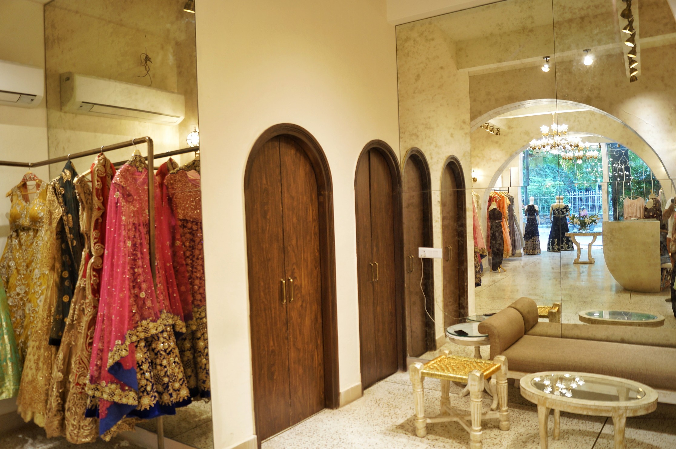
·        Explicate Space- The overall area is defined by fine geometry and sharp edges. The use of mirror adds depth and its strategic placement helps to enhance the intensity of the corridor.

·        Organize Space- The arrangement of shelves on either sides leaves a void in the centre creating the ease of movement for customers.

·        Sequential Experience- Keeping the customers thought process in mind, the retailers know what products to be placed in which part of the store, so as to make the former move around the whole area.

·        Visual Merchandising- Windows are the eyes of a retail store and should hence; tell a story that is carried through the space. The trick is to explore creative interpretations, while always placing the product at the heart of the display.

·        Customer Participation- It is important for a retail store to slow down the customer and the key to doing that lies in putting large, eye- catching display at the entrance.

Once the overall structure and circulation of the space has been determined, the atmosphere and thematic of the space must be created through lighting, sound, materials and visual branding. These design elements will cohesively have the greatest impact on the consumer and thus the level of productivity that could be achieved.

UB_BLOG4.jpeg

I thought of providing maximum natural light and that was achieved by all glass facades. It also enabled to provide customers with an unobstructed look of the interiors.

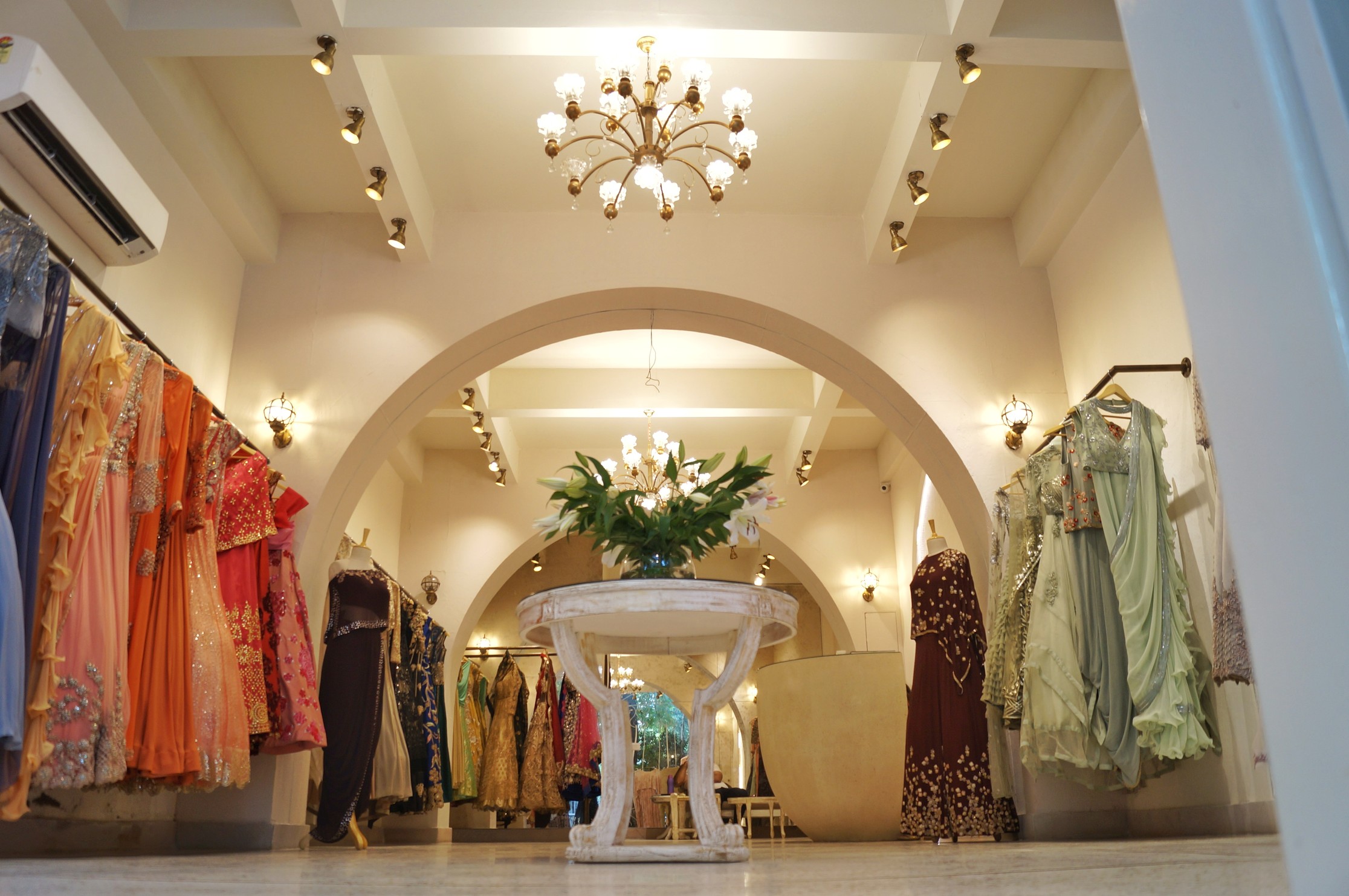
 The availability of natural light in the store adds clarity and interest to the space and also helps customers in examining the quality of merchandise. The next important feature was the lighting. With dramatic use of chandeliers, brass spotlights and antique wall lights, the colour of lights being yellow, a festive and celebratory semblance was achieved.

The colours used for the design of the boutique is predominantly simple, the major colour being white and shades of cream with antique brass finishes for lights and furniture, the architect has also used green as an indirect colour in the form of plants at the entrance which can be seen from the inside through the unanimously beautiful steel jail work.

With the emergence of internet and online shopping trends, the retail faced a downside. The only way to put up with it was by understanding the need of customers and providing them with exactly that. Damon Richards said, “Your customer doesn’t care how much you know until they know how much you care.” The regal lighting and simple colour scheme enhances the overall experience of coming to this place, the design is so subtle and exasperatingly simple yet it speaks volumes. 

At UB Designs our focus is on state-of-art retail designs, following the brand language and visual merchandising as its core